JBL Design System
A shared foundation for global commerce
Product Design Lead · Leading 1 junior designer & 1 graphic designer
I led the redesign of JBL’s digital shopping experience and the design system behind it, bringing a refreshed brand, clearer product discovery, and reusable commerce patterns into one global framework.
Working hands-on with a small design team, I aligned brand, commerce, and engineering around a system regional teams could confidently use. We introduced the experience through measured releases, protecting an approximately $250M annual online business while improving how customers found and purchased products.

Results at a Glance

The Challenge: A Growing Product Portfolio Needed a Clearer Digital Experience
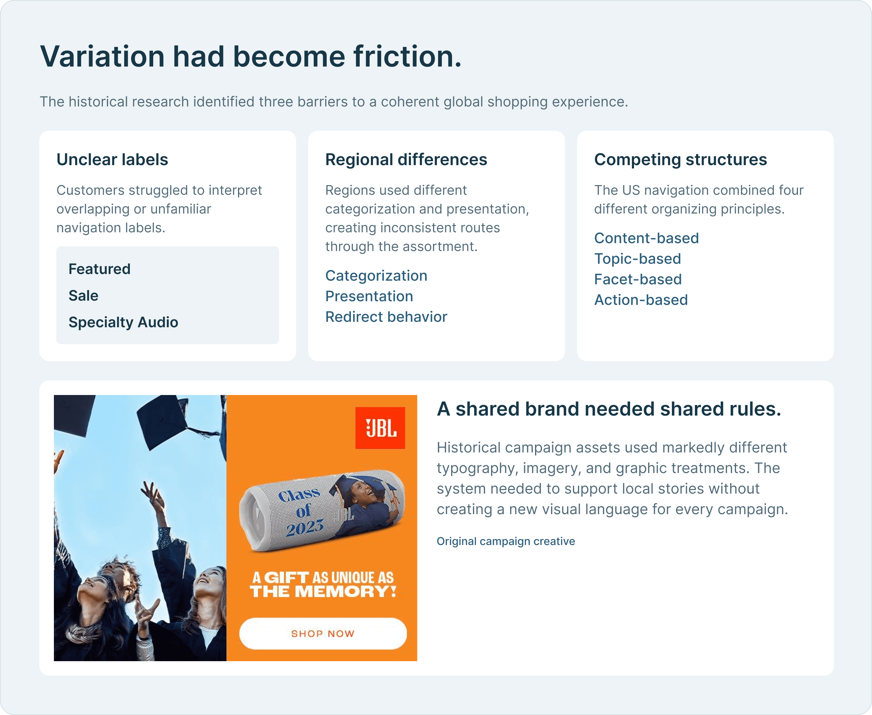
JBL’s website had to serve a broad and growing assortment across regions, audiences, and shopping needs. Over time, regional variations, promotional treatments, and competing ways of organizing products had made that experience inconsistent.
At the same time, the Brand team was developing a new visual identity and audience strategy. The opportunity was larger than a reskin: we needed to translate that direction into a shopping experience that helped customers understand the products and gave regional teams a repeatable way to present them.
We also inherited much of the existing backend. Every proposed interaction had to balance customer value, brand ambition, implementation effort, and the continuity of a substantial commerce business.
Connecting Brand Ambition With the Realities of Shopping.
As the design lead, I was accountable for the overall experience and the system that would sustain it. I worked directly on the interface while leading a junior product designer and a graphic designer through execution.
I brought recommendations to Brand & Marketing, E-commerce, and Development, explaining the customer rationale and implementation tradeoffs behind design decisions. Quarterly executive reviews secured alignment and approval; monthly studio updates supported planning and resourcing.
Within the team, I delegated subcategory pages and less complex modules to the junior designer, with weekly reviews and mentorship. Our graphic designer developed and adapted assets within the visual direction I established. I made space for both designers to present their work and speak for their decisions, helping them build ownership alongside delivery.

Product Discovery Had to Reflect How People Used Their Speakers
The research program included 27 participant interviews and navigation testing across markets. I planned studies and coordinated analytics synthesis with JBL’s research team, while Brand & Marketing contributed audience and segmentation research.
A central finding was the gap between how the company described its products and how customers approached them. Internal product groupings did not always translate into clear shopping categories. Customers connected more readily with where and how they would use a speaker.
I worked with Brand, E-commerce, and industrial design stakeholders to translate that insight into a more understandable hierarchy. This required alignment beyond the website: the navigation needed to bridge internal product structures and customers’ expectations.
With comparable tasks, audience definitions, and success criteria, direct navigation success improved from 40% to 74%—a gain of 34 percentage points.


Making the New Brand Work as an Interface.
The refreshed identity introduced new typography, color, and graphic expression. My responsibility was to turn those choices into a usable digital language, with clear hierarchy and recognizable interaction patterns.
That meant challenging brand decisions where they conflicted with the experience. The proposed brand orange did not provide sufficient contrast for white text on action components. I advocated for a darker orange for those controls, preserving the brand’s character while improving legibility and meeting the relevant text-contrast requirement.
I also pushed back on treating every brand request as a reason to invent a new component. Shared patterns gave customers a more predictable experience and gave the organization a foundation it could maintain.

Reusable Patterns Gave the Brand Room to Grow.
The toolkit connected foundational design rules to reusable components, page modules, and complete templates. It covered the shopping journey, from navigation and product discovery to product detail, and extended into editorial and support experiences.
Each module needed to do more than look consistent. It needed to explain how content should be structured, which variations were appropriate, and how the pattern should behave across layouts. We also accounted for longer localized text so regional content could fit without losing hierarchy.
To give the system a recognizable graphic language, I developed a direction based on cymatic resonance patterns. Working with our graphic designer, we built a Brand-approved library of assets and supporting treatments that could be reused across modules.
This allowed the brand to stay expressive while reducing the need to solve familiar layout problems again for every campaign or market.

Protecting Product Evaluation from Promotional Interference.
Commercial requests often focused on making promotions more visible. I argued that the experience also had to protect the customer’s ability to inspect a product, understand its value, and make a confident decision.
This shaped two decisions. First, we gave technology and product benefits more prominence instead of relying on discount-heavy presentation. Subsequent brand research indicated stronger brand perception.
Second, I advocated removing promotional UI that obstructed the product experience. We tested the removal on high-traffic products using a 10% traffic treatment. Across the tested products, product cart conversion increased 42% relative to the comparison experience, aggregated using average cart SKU counts.
The result gave us a commercial reason to protect the experience and a concrete precedent for future governance decisions.

Using Evidence to Challenge Features That Made Shopping Harder
Executives were interested in using Einstein to personalize product recommendations. I raised concerns about the performance cost, then used the phased rollout to test the proposed navigation experience.
With personalized recommendations enabled, the average time from clicking to a fully loaded navigation dropdown reached 2.5–3 seconds. The associated drop-off gave us evidence to remove the tested integration rather than expand it.
Other decisions required sequencing rather than rejection. The inherited backend could not support adding products directly to the cart from category pages within the launch scope. We deferred those interactions and retained the product-detail purchase path. I also recommended delaying expanded product-personalization journeys until the underlying capability was ready to support them.
These tradeoffs kept the rollout focused on improvements we could deliver reliably, while preserving a path for later functionality.

Making the Rollout a Sequence of Measurable Decisions
With approximately $250M in annual online revenue at stake, a major redesign needed a controlled path to release. I proposed and oversaw a phased approach, beginning with a reskin of familiar patterns before introducing more substantial module and navigation changes.
For each phase, 10% of US traffic received the new experience. Visitors were randomly assigned, and that assignment remained consistent on return visits. We monitored performance for one month, prioritizing purchase conversion, with cart abandonment and site engagement as supporting measures.
Successful phases expanded to all traffic before the next phase entered testing. This gave customers time to adapt and gave the organization evidence for each step. R5 was released in Q4 2024; regional expansion continued through the remainder of the year and completed in Q1 2025.

Regional Independence Depended on Shared Rules
The system needed to work for the people maintaining the site every day. I delivered annotated design documentation to Development, whose team built reusable components and a companion documentation site based on that guidance.
Through Page Designer in Salesforce Business Manager, regional merchandisers could assemble developer-created modules and populate them with approved content. Stories, ambassador announcements, and campaign pages could be produced without initiating a new design effort for every page.
I developed the approval process with Brand & Marketing. Exceptions required joint approval from me and the Brand lead, while Development served as the final check against unapproved materials entering the live site. Weekly regional audits helped me identify layout, localization, and brand issues after launch.
We supported adoption with a three-week global workshop program, team-specific training, recordings, and CMS demonstrations. When a regional team proposed off-brand holiday collateral, we worked with them to revise the assets and clarify how to create future material within the system.


The System Became a Foundation Beyond the Website
The US site’s commercial results showed that a stronger brand experience and effective commerce could advance together. Over the three months following full rollout, purchase conversion rose from 2.6% to 3.2%, revenue per visitor increased 24%, and cart abandonment fell 9 percentage points compared with the three-month pre-rollout period.
The system was adopted across the US, Brazil, APAC, and EMEA, with global rollout completed in Q1 2025. Reusable patterns brought stories, ambassador announcements, and campaign pages into a consistent global framework.
Its influence also extended beyond web commerce. Global teams contacted me to help align point-of-sale interfaces and other digital efforts with the system, making the website work a reference for broader customer touchpoints.